Payment-to-Income Ranks Risk
Payment-to-income usually does not get the first look in auto ABS. FICO gets the headline. LTV gets the collateral discussion. PTI often sits deeper in the tape.
That is easy to understand, but it leaves useful information on the table. Within both prime and subprime auto loans, higher payment burden lines up with higher early default risk.
What the chart shows
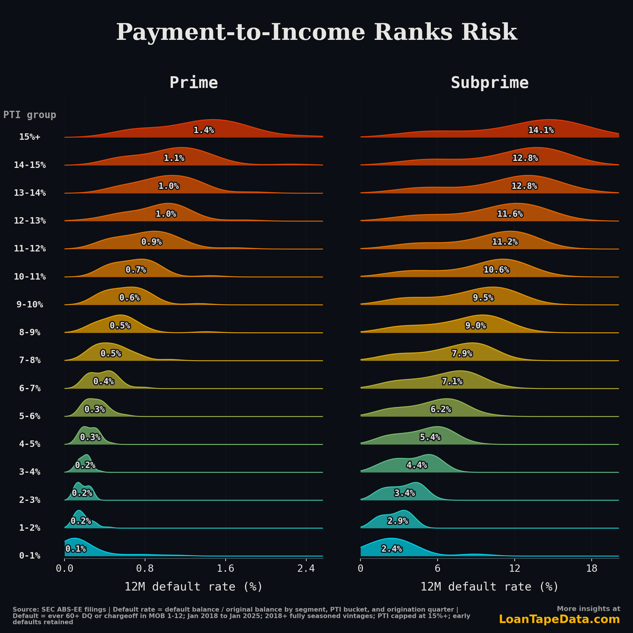
Each ridge is a distribution of quarterly origination-vintage default rates. The label inside the ridge is the median quarterly 12-month default rate for that PTI bucket.
We split the book into two FICO bands: prime borrowers at 660+ and subprime borrowers below 660. PTI is bucketed in one-point bands from 0-1% through 14-15%, with everything 15% and above grouped together.
The cap matters. There are loans above 15% PTI, but once you split by FICO, quarter, and one-point PTI band, the far tail gets thin quickly. The 15%+ bucket keeps the stretched borrowers visible without making the chart pretend that every tail bucket has the same support as the core range.
The pattern is hard to miss. In subprime, the median 12-month default rate rises from 2.4% in the 0-1% PTI bucket to 14.1% in the 15%+ bucket. In prime, it moves from 0.1% to 1.4%.
Different base rates. Same ordering.
FICO does not absorb the PTI signal
The subprime panel is the loud one. Payment burden moves default risk in a mostly steady climb:
| PTI bucket | Median 12M default rate |
|---|---|
| 0-1% | 2.4% |
| 3-4% | 4.4% |
| 6-7% | 7.1% |
| 9-10% | 9.5% |
| 12-13% | 11.6% |
| 15%+ | 14.1% |
A subprime borrower at 15%+ PTI has almost six times the early default rate of a subprime borrower below 1% PTI.
Prime is quieter because the base default rate is much lower. But the rank order is still there:
| PTI bucket | Median 12M default rate |
|---|---|
| 0-1% | 0.1% |
| 3-4% | 0.2% |
| 6-7% | 0.4% |
| 9-10% | 0.6% |
| 12-13% | 1.0% |
| 15%+ | 1.4% |
The spread is smaller in percentage points, but it is still meaningful for sorting risk. FICO tells you about borrower history. PTI tells you how much room the borrower had in the monthly budget at origination. The two are not substitutes.
Why we used quarterly vintages
We started with monthly origination vintages. The conclusion was the same, but the ridges were too choppy. That is what happens when you cut the data by FICO band, one-point PTI bucket, and origination month at the same time.
Quarterly vintages are a cleaner read. They keep the cohort view, give each point more support, and still let underwriting changes show up on a practical timeline.
The chart uses 29 quarterly origination vintages from January 2018 through January 2025. That gives every included vintage a full 12-month outcome window.
The underwriting read
PTI is an affordability measure at the borrower level. It is not trying to be a macro forecast, and it is not a replacement for FICO.
A high-PTI borrower is not automatically a bad borrower. They may have steady income, a clean credit file, and a loan that performs. But they also have less payment cushion. A repair bill, missed paycheck, rent increase, or insurance reset has fewer places to go before it reaches the auto payment.
That is why the relationship shows up in both panels. Subprime borrowers start with a higher baseline risk because prior credit performance is weaker. Prime borrowers start with a lower baseline risk. As payment burden rises, the direction is the same.
For surveillance, the better questions are:
- How much of the book is above 10% PTI?
- Is the 15%+ PTI share growing in recent originations?
- Are high-PTI loans also carrying other stress flags, like high LTV, older collateral, or longer terms?
The third question is where PTI becomes more than a one-variable screen. A 15% PTI loan with normal LTV and newer collateral is one risk. A 15% PTI loan with stretched LTV, an older vehicle, and a long original term is a different one.
What this changes in monitoring
Most auto ABS summaries already show FICO, LTV, and term. PTI often gets less attention because the field can be sparse, noisy, and issuer-dependent.
When the support is there, it is worth using. PTI is hard to recreate later. You can observe delinquency after the borrower misses payments, but by then you are looking at the outcome. Origination PTI tells you whether the borrower was stretched on day one.
For a cohort monitor, I would track three PTI cuts:
- Share of new originations above 10% PTI.
- Share of new originations above 15% PTI.
- Default rate by PTI bucket inside FICO bands, not just at the full-book level.
That last split matters because otherwise PTI can get mistaken for a disguised FICO chart. It is not. Even after separating prime from subprime, the rank order remains.
Methodology
Data is from SEC-filed loan-level ABS-EE auto loan disclosures in the LoanTape warehouse. We use non-lease auto loans with valid FICO scores from 300 to 850, valid non-negative payment-to-income percentage, positive original loan amount, and sufficient performance history.
The sample includes origination vintages starting January 2018 and ending with vintages that have a full 12-month outcome window. For the quarterly chart, that is January 2018 through January 2025.
Default is defined as ever reaching 60+ days delinquent, loss, or chargeoff during MOB 1-12. Loans that default or terminate before month 12 stay in the denominator.
Default rates are balance-weighted within each origination quarter, FICO segment, and PTI bucket:
default original balance / total original balance
Each ridge is the distribution of those quarterly vintage default rates. The inline label is the median quarterly default rate for that PTI bucket, not the pooled all-loan default rate.
If you want loan-level access to the auto ABS cohorts behind this chart, that is covered in the ABS-EE dataset and Form 10-D remittance data.